Unilever
Unilever is a big, multinational corporation that is one of the largest consumer goods companies in the world. Some of the product-types they manufacture are food and drink, personal care and beauty. Unilever owns many other smaller brands in other countries around the globe.

This logo for the english/dutch company Unilever, was made by designer Wolff Olins in 2004. It replaced the company’s old logo which they had been using since 1970.
We can clearly see that the logo is supposed to be the letter «U». This makes it easier for consumers to recognize, as it is a simple shape. Also by making the shape out of a letter of the alphabet, we will more easily perceive the logo visually, as most of the world have a deep connection to the latin alphabet and the shapes of this alphabet. If we look more closely, we can see that the shape is actually comprised of 25 different shapes.
Many people believe that the shapes are just a neat graphical element that makes the logo somewhat unique. I also believed this was the case, until I researched the logo more thoroughly. All the 25 icons that you can see in the logo have a deeper meaning than just fancy design.These shapes symbolizes various attributes that the company wants to project to the consumer. These images from the Unilever website explains all the contextual meaning behind the figures.
As you can see, all the shapes that make up the logo have individual meaning. But they are also grouped together, and are as such a unified shape.This is a very effective visual idea, as you can connect every shape and their individual meaning to the brand identity. Unilever writes on their website that the company’s goal is «making sustainable living commonplace». Each of the icons in the logo represent a value that Unilever deems . The icons represent an aspect of the company’s business. It also tells us that even though the company may seem scattered over multiple areas, they are all a part of the brand. The icons harmonize together even though they are not similar, and this symbolizes the sustainability of Unilevers business.
The «Unilever» text, which is placed underneath is consistent in style with the logo. It gives of a feeling of energy, life, reliability and elegance. The script-style of the font makes it feel more personal and relatable. It is perhaps visually understated but not in any way dull or lifeless. This way it doesn’t steal any attention from the main part of the logo, the «U» shape.
Unilever & gestalt principles
I covered the topic of gestalt psychology in design to some extent in this blog post, so I will not write that much about it in this post. In the blog post, I wrote about the nine different gestalt principles: proximity, pragnänz, continuation, figure/ground, regularity, closure, similarity, symmetry and common fate. In that post, I actually used the Unilever logo as an example of the gestalt law of proximity. But as I mentioned in my earlier blogpost, many logos – including Unilevers – use more than one gestalt principle/law to convey their message. As I see it, the Unilever logo utilizes mainly three principles. These are:
- Pragnänz
- Proximity
- Similarity
Pragnänz
Pragnänz is german word that translates to «good figure». When our brain sees a complex or ambigous shape, it will always interpret the shape in the easiest way possible. The human mind simplifies the shape, and interprets the shape in the most basic way. This is why we sometimes feel like we see faces in objects and images. In the case of the Unilever logo, the law of pragnänz tells us that we will perceive the collection of shapes in the easiest way. So we see the letter «U». The logo is concise and has a clear form. We can use this knowledge in design; by using complex and weird shapes that can be seen as a much simpler image.
Proximity
This principle/law states that visual elements that are close to each other, will be perceived as a unified whole by our brain. This is because the human mind wants to read visual stimulus as quick as possible, so it will always take the path of least resistance. For example, in the case of the Unilever logo, our brain will read it as a unified group, even though the logo is actually comprised of 25 unique graphical elements. The law of proximity tells us that the human brain will group together the icons in the logo, because they are closely grouped together. It doesn’t matter that the icons are neither similar nor symmetrical.
Similarity
This principle is similar (get it?) to the law of proximity. The law of similarity tells us how our brain groups together individual elements to form a unified whole. Visual objects that are similar, will be grouped together. The similarity can be in various forms, such as shape, color, orientation or size. Our brain will automatically
Recreating the logo
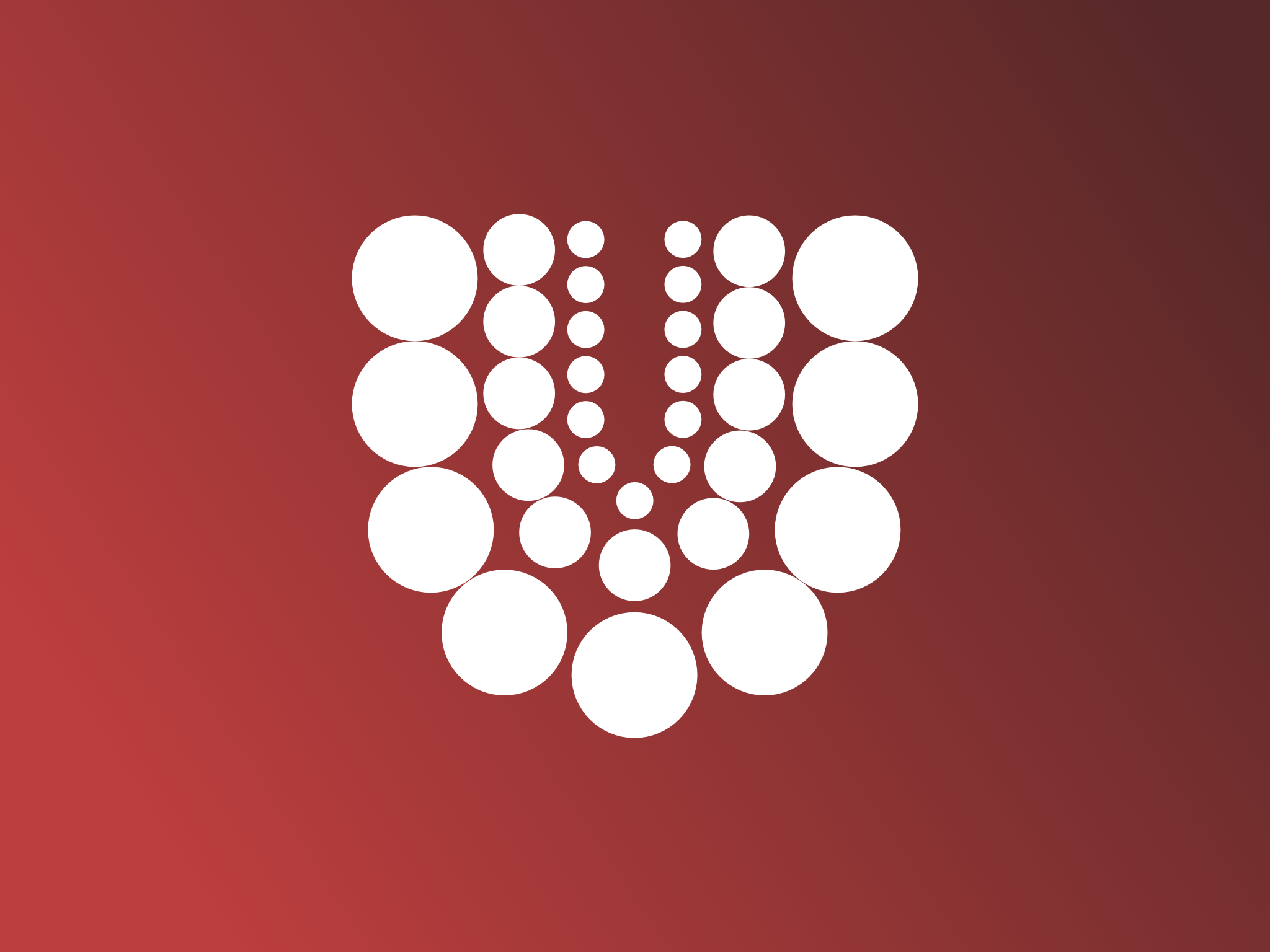
I chose to recreate the logo in the laws of proximity, symmetry and figure/ground. I sketched a couple of ideas which I will post here. I . I am pretty happy with the results, but I wish I could have been more daring in the overall design choices, but seeing as the task was to recreate the logo, I figured i shouldn’t really alter the concept of the logo too much. I kept the «U» letter as the main graphical element, and made some variations on different designs. I wanted to make the logo more engaging, and I can’t really tell if I achieved this or not.

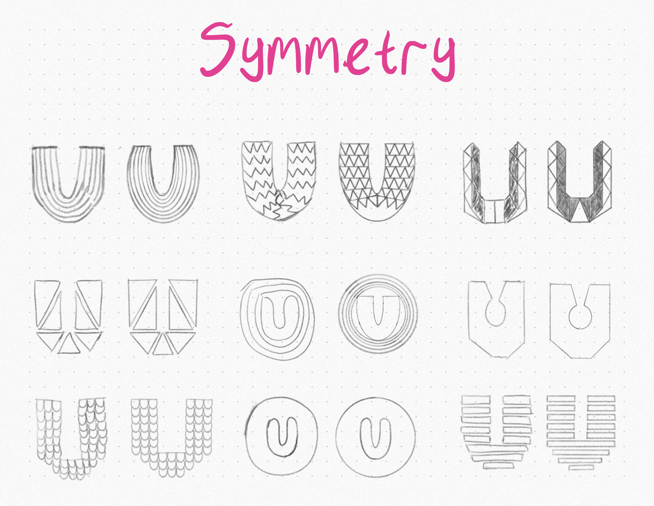


After I had done the sketches, I choke the one I liked the best and made a vector-illustration of it in Adobe illustrator.


Sources
http://www.logodesignlove.com/unilever-icons
https://www.interaction-design.org/literature/article/the-law-of-similarity-gestalt-principles-1
http://www.en.wikipedia.org/wiki/Gestalt_psychology#Prägnanz
http://www.smashingmagazine.com/2014/03/design-principles-visual-perception-and-the-principles-of-gestalt/www.logodesignlove.com/unilever-icons
https://www.interaction-design.org/literature/article/the-law-of-similarity-gestalt-principles-1
http://www.en.wikipedia.org/wiki/Gestalt_psychology#Prägnanz
http://www.unilever.com/about/who-we-are

Legg igjen en kommentar